As a front-end developer, most of the time we will be dealing with a lot of screens and components within a project. However, one of the challenge that developers face is communication between the team and the stakeholders. Storybook improves communication through documenting and visualize the UI component to everyone. This ensures that everyone involved in the project are on the same page.
"Storybook is an open source tool for building UI components and pages in isolation. It streamlines UI development, testing, and documentation," a direct quote from Storybook's official website. It is popular for creating a well-documented design system. It is being use by renowned mncs such as Audi, Toptal and Grafana. The project was started back on 2016 and is still actively maintained by Chromatic team and the community.
Storybook is framework agnostic. It can be integrated to any of the popular front-end framework such as Vue, Angular and React seamlessly.
Storybook advocates component-driven methodology when developing UI components so that the components are modular and reusable throughout the entire application.
Features
Component Visualization
Storybook provides an isolated environment for us to develop, test and explore components without having to worry about fetching data from API or business logics.
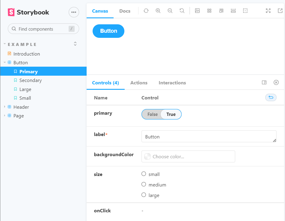
The component that are being selected can be showcased individually without distractions within the canvas that Storybook offers. The image below are an example screen of the component showcase.

This eliminates the tedious process of loading everything up just to make sure that one single component is working as expected. As you may imagine, this drastically improves the efficiency and saves a lot of time.
Automated Documentation
Documentation are crucial in development as it conveys the entire application as words that are easily understandable to other potential users. With Storybook, the process for documenting the application are much more easier and quicker.
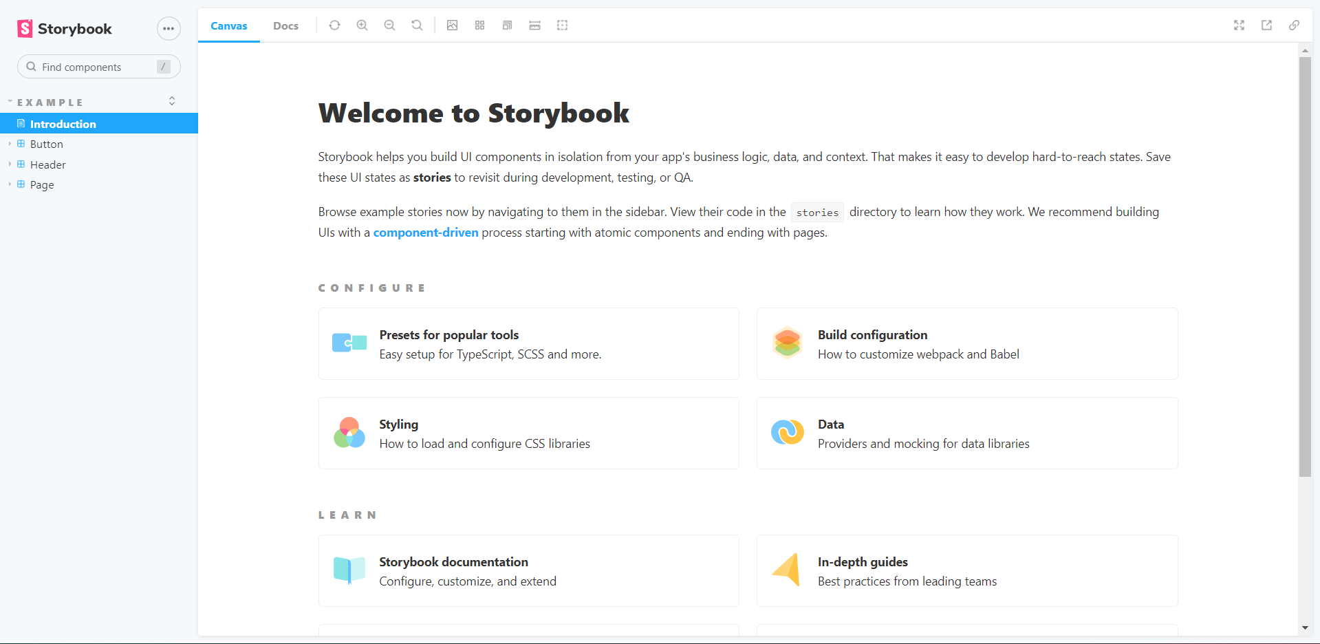
To write an entire page of documentation that contains general information, it can be done by creating a Markdown React file anywhere within the src folder. The file created will need to end with .stories.mdx extension.
The image belows are an example of general documentation page in Storybook.

Markdown supports basic HTML too and this flexibility allows users to style their docs with aesthetics that fits their brand.
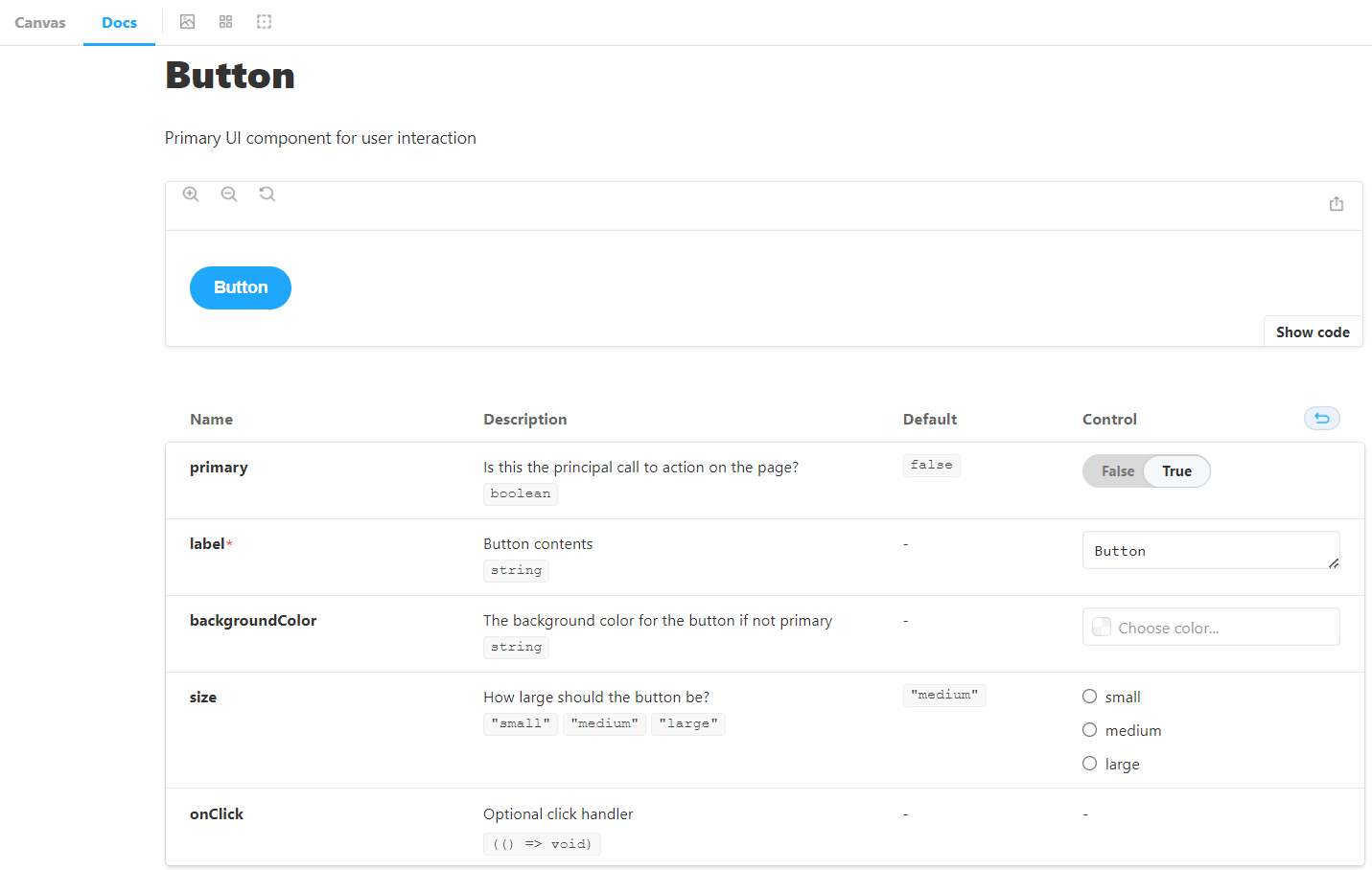
Component documentation are auto-generated based on docstrings for the component props. It can be accessed through the "Docs" tab in the component page.

The example above shows the documentation of the Button component and its prop declaration looks like this:
type ButtonProps = {
  /* Is this the principal call to action on the page? */
  primary?: boolean;
  /* Button content */
  label: string;
  /* The background color for the button if not primary */
  backgroundColor?: string;
  /* How large the button should be? */
  size: "small" | "medium" | "large";
  // ... the rest of props
}
Rich Integrations/Addons

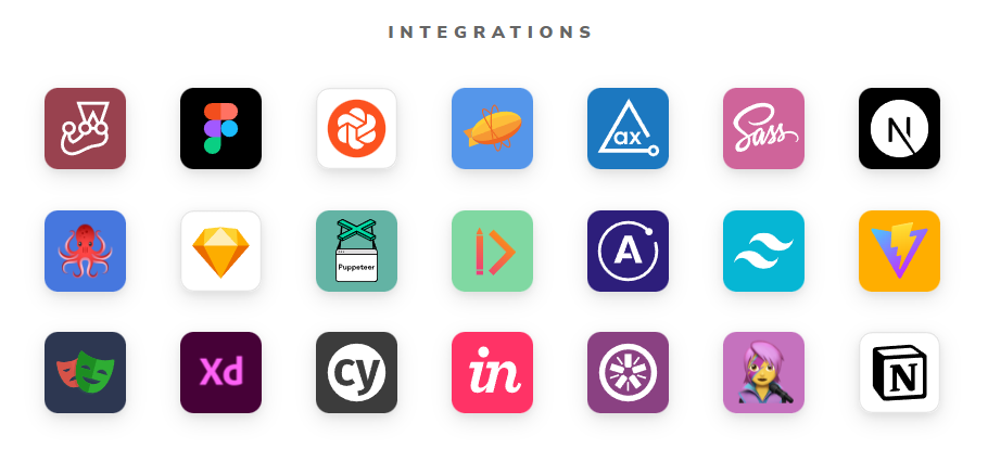
There are a myriad of different addons that can be integrated with Storybook. These different addons offers a flexible choice for the user to choose the workflows that suits them well.
Some of the popular addons including but not limited to Links, Accessibility, Chromatic and Interaction. More useful addons can be found on the official website here.
Testing
The simplest testing method is to spot check the components before and after to see if there are any discrepancies with the intended behavior. Automating the test are possible as Storybook offers visual tests that snapshot each of the component pixel by pixel. If changes are detected, it will show where the changes are. If the changes are intended, we can accept the new changes as the baseline that is used for comparison for the next test run.
Storybook can also test the behaviour of the components such as events and state. It also provides the option to test for accessibility compliance through the accessibility addon provided by the Storybook team.
Storybook User Interface
There are 3 parts that made up of the UI for Storybook, namely sidebar, action bar and the control panel.
The sidebar consists of links and folders to each individual component stories and Markdown documentations. The action bar on the other hand provides controls such as zooming in and out, setting background color, fullscreen etc.
Control Panel
The control panel contains all the available controls for the value of the component. Storybook will use the default widget for each of the suitable variable types of the component. Through the widgets provided, users can make quick changes on the props and the changes will be reflected immediately on the canvas.
There are a number of types of the controls built into Storybook.
| Data types | Available Control | Description |
|---|---|---|
| boolean | boolean | Provide a switch to toggle on and off |
| number | number | Provide an input box for numbers only, optionally with minimum, maximum and steps set. |
| range | Provide a slider component that includes all possible numbers | |
| object | object | Provides an input that accepts the object as JSON string |
| array | object | Provides an input that accepts the array as JSON string. |
| file | Provides a file input component that can accept multiple file as URLs | |
| enum | radio | Provides radio buttons for different values in multiple linespan |
| inline-radio | Provides radio buttons for different values in single line | |
| check | Provides a set of checkbox for different values in multiple linespan | |
| check-inline | Provides a set of checkbox for different values in single line | |
| select | Provides a dropdown list to select from | |
| multiple-select | Provides a dropdown list to select multiple values | |
| string | text | Provides an input field for string |
| color | Provides a color picker | |
| data | Provides a date selector |
How to use Storybook
This following section will be using React and TypeScript for the quick demo. The concept applies across all the other framework with slightly different syntaxes.
Default Export
Every storybook files starts with a default export of an object. The object contains all the necessary information to depict and describe the story file. The title is the component's name that will be displayed in Storybook. The component takes in the actual component itself for rendering.
Let's say you have a "Button" component inside Button.tsx, create a new story file named Button.stories.tsx with the contents below.
import { ComponentMeta } from "@storybook/react";
import Button from "./Button";

export default {
    title: "Button",
    component: Button,
} as ComponentMeta<typeof Button>;
Creating Variants
To create a story for the Button, you need to export it individually with the props applied to the Button as such:
// Default styled button
export const Default = () => <Button label="Click me" />;

// Primary styled button
export const Primary = () => <Button label="Click me" primary />
The props for the component are not customizable at the moment. It cannot take any inputs from the user. To make it customizable, create a reusable Template and assign args to each of the variants.
import { ComponentStory } from "@storybook/react";

const Template = (args: ButtonProps) => <Button {...args} />;

export const Default: ComponentStory<typeof Button> = Template.bind({});
Default.args = {
    label: "Click me",
};

export const Primary: ComponentStory<typeof Button> = Template.bind({});
Primary.args = {
    label: "Click me",
    primary: true,
};
Customizing Themes
Storybook are available for customization based on the addon.
yarn add --dev @storybook/addons @storybook/theming
To create a simple theme, go to the .storybook directory and create a new Javascript file and give it a name for the theme.
import { create } from '@storybook/theming';

export default create({
  base: 'light',
  brandTitle: 'My custom storybook',
  brandUrl: 'https://example.com',
  brandImage: 'https://place-hold.it/350x150',
  brandTarget: '_self',
});
The theme will
- use light theme by default
- Replace storybook logo with own logo image
- Add custom brand info
- Set the logo url
Import the theme into the manager.js to apply the theme.
import { addons } from '@storybook/addons';
import yourTheme from './YourTheme';

addons.setConfig({
  theme: yourTheme,
});
Read more on theming here.
Summary
In a nutshell, Storybook is extremely helpful when it comes to front-end development. It is used for isolating components for visualization and development. It is also a great tool to produce top-notch documentation of a project. There are a lot of addons available that can be integrated with Storybook to extend its capability.
Links and Reference
- Storybook website
- Storybook Github
- Storybook Twitter
- 9 Most Useful Storybook Addons and Features Through Examples
- Storybook JS – master components with this frontend tool
- How to simplify component testing with React Storybook
- Storybook React: A Beginner's Tutorial to UI Components
- Component Driven User Interface
- React Storybook Crash Course
- Build and Document React Components With Storybook
- Storybook in 100 Seconds
- Using Storybook stories with Testing Library